- AI Business Insights
- Posts
- AI Makes Your Infographic
AI Makes Your Infographic
Gemini Now Builds Infographics
Your days of struggling with clunky design software or staring at ugly spreadsheets are officially over.
AI can now transform your raw data into a professional-looking infographic, and you don’t need a single ounce of design experience to do it.
I was scrolling through my feed when I saw this awesome walkthrough from a savvy professional, and I was blown away by how simple the process is.

Want to get the most out of ChatGPT?
ChatGPT is a superpower if you know how to use it correctly.
Discover how HubSpot's guide to AI can elevate both your productivity and creativity to get more things done.
Learn to automate tasks, enhance decision-making, and foster innovation with the power of AI.
*Ad
The mind behind it revealed that you can do this entirely for free using a feature inside Google’s Gemini.
The Core Idea: Using Gemini Canvas
The secret is a built-in Gemini feature called ‘Canvas’. You don’t need to download anything or sign up for a new tool. The creator explains that all you have to do is provide a clear prompt with your data and instructions, and the AI handles the entire design process, from layout to color selection.
This is a huge step forward for anyone who needs to visualize information quickly without a budget for a designer.
Deep Dive: The Step-by-Step Process
I love how straightforward the workflow is. This industry pro laid out the exact steps to get from a blank page to a finished infographic in minutes. It’s almost unbelievably easy.
Head over to gemini.google.com.
Make sure the ‘Canvas’ feature is enabled.
Write your prompt explaining the infographic you want.
Hit ‘Create’.
Select the ‘Infographic’ option when it appears.
Watch the AI generate the visual for you.
From there, you can easily share it with a custom link or post it directly to social media!
Insight 1: Speed vs. Control
The biggest takeaway is the trade-off. On one hand, the process is incredibly fast and perfect for non-designers. The post’s author highlights that it maintains visual consistency and is great for storytelling, which cuts down on outsourcing costs. However, this comes at a price. The creator is also transparent about the cons: you get limited customization options, text can sometimes be hard to read, and you have much less control over the fine details compared to using a tool like Figma or Canva.
An AI scheduling assistant that lives up to the hype.
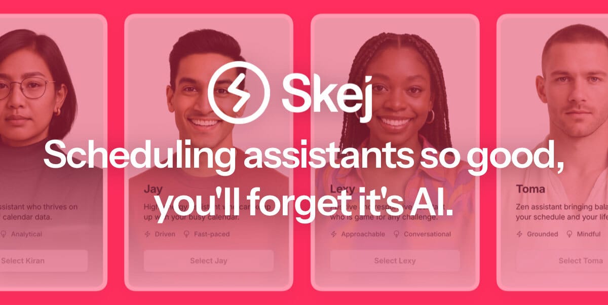
Skej is an AI scheduling assistant that works just like a human. You can CC Skej on any email, and watch it book all your meetings. Skej handles scheduling, rescheduling, and event reminders. Imagine life with a 24/7 assistant who responds so naturally, you’ll forget it’s AI.
*Ad
Other awesome AI guides you may enjoy
Insight 2: Prompting for Professional Results
This is where the real value is. The difference between a generic AI output and a great one is all in the prompt. The original poster shared some brilliant do’s and don’ts that act as a guide for getting better results. For example, instead of just dumping in data, you should prompt for a ‘readable font hierarchy’ and ‘limit colors to 2–4 max.’ This tells the AI to create a clean, focused design rather than a chaotic one.
Insight 3: Avoiding Common Pitfalls
Just as important as what to do is what not to do. The person who shared it warns against overloading the AI with too much information in a single prompt. It’s better to stick to one clear message. They also advise against prompts that might lead to misleading data visualizations or use low-contrast colors, which would make the infographic hard to read. A key tip is to specifically prompt the AI not to ‘crowd out white space,’ which gives your information room to breathe and makes it look more professional.
This is just a quick look at the method. The original LinkedIn post from this talented creator offers a more detailed explanation.
In partnership with
Fandom Cut Manual Moderation 74%—Join the Nov 18 Webinar

Fandom, the world’s largest fan platform with 350 million monthly visitors, needed to ensure safety, quality, and monetization across 250,000+ wikis. With Coactive, they reduced manual content moderation by 74%—freeing teams to focus on higher-value work.
Join our exclusive webinar on November 18 at 9:15 am PT / 12:15 pm ET to learn how Fandom harnessed AI to transform content moderation and ad monetization.
You’ll discover how they achieved:
• 74% fewer manual moderation hours, boosting team morale
• 50% cost savings through automated image review
• Higher ad revenue with brand-suitable content at scale
Learn how to turn your content into a powerful, monetizable asset that improves user experience and cuts costs.
Register today to join live or watch the recording anytime.