- AI Business Insights
- Posts
- 12 hours of design work, gone in 60 seconds
12 hours of design work, gone in 60 seconds
The infographic workflow got rewritten
Remember the last time you made an infographic? Five tabs open, a half-finished Canva file, two hours hunting for a stat you saw last week, fonts that almost match, and a final output you kind of hate.
That whole routine is getting replaced by one sharp prompt. Not hype. I ran the workflow twice this week and the second attempt took under a minute.
A LinkedIn post from an AI professional laid out the full system. Five steps, four tools, one prompt formula that separates the lazy outputs from the ones that travel. Here is the breakdown and the part that actually changes how you work.
In partnership with
How Jennifer Aniston’s LolaVie brand grew sales 40% with CTV ads

For its first CTV campaign, Jennifer Aniston’s DTC haircare brand LolaVie had a few non-negotiables. The campaign had to be simple. It had to demonstrate measurable impact. And it had to be full-funnel.
LolaVie used Roku Ads Manager to test and optimize creatives — reaching millions of potential customers at all stages of their purchase journeys. Roku Ads Manager helped the brand convey LolaVie’s playful voice while helping drive omnichannel sales across both ecommerce and retail touchpoints.
The campaign included an Action Ad overlay that let viewers shop directly from their TVs by clicking OK on their Roku remote. This guided them to the website to buy LolaVie products.
Discover how Roku Ads Manager helped LolaVie drive big sales and customer growth with self-serve TV ads.
The DTC beauty category is crowded. To break through, Jennifer Aniston’s brand LolaVie, worked with Roku Ads Manager to easily set up, test, and optimize CTV ad creatives. The campaign helped drive a big lift in sales and customer growth, helping LolaVie break through in the crowded beauty category.
The shift that matters most
Six to twelve hours of manual design work is now thirty to sixty seconds with AI. No design skills, multilingual variants on demand, real data baked into the visual. That is the headline.
The line that deserves a second read sits one layer under that claim. Creation is cheap now. Thinking and taste are the real edge.
When anyone can produce a clean visual, the moat shifts. It is no longer about who owns Illustrator or who has the cleanest template library. It is about who knows what to say, who they are saying it to, and what the reader should do next. The tool collapses execution. It does not collapse judgment.
Why your current prompt is the bottleneck
Most people are getting mediocre AI infographics because they are writing mediocre prompts. Here is the side by side from the original post.
Average: "Make infographic on productivity."
Viral: "5-section infographic on deep work for busy professionals, minimal black-gold theme, stats included. Here is the text for the infographic: [Add text]. Here is more context on what to create: [Add context]."
Sections, audience, theme, stats, text, context. Every variable locked down. The model stops guessing and starts executing. That is the whole difference between a first draft you throw out and a first draft you ship.
Five formats that consistently win
Not every infographic type performs the same. The original post broke it down into five reliable formats, and the pattern is worth memorizing.
Statistical for reports and surveys. Process for step-by-step guides. Timeline for evolution and history. Comparison for tools, products, or before and after. Educational for simplifying complex topics.
Pick the format before you pick the tool. The format decides the structure. The structure decides the prompt. The prompt decides whether you waste two hours or two minutes.
How to do it
This is the five-step workflow from the post, with the reasoning behind each step so you know why it works.
Step 1. Define the goal. Awareness, education, or action. Pick one. Every design choice downstream flows from this. A visual built for awareness looks nothing like one built to drive a click.
Step 2. Write a sharp prompt. Sections. Audience. Theme. Stats. Text. Context. Every variable locked down before you hit send. A vague prompt gets you vague output. A surgical prompt gets you a usable asset on the first try.
Step 3. Pick the right AI tool. Canva AI for quick, presentable visuals. Napkin for clean minimal outputs with an editorial feel. Adobe Express AI for social-ready sizing across platforms. Google Nano Banana Pro for deep, data-rich infographics when the content needs to carry weight. Match the tool to the format. Do not fight the software.
Step 4. Refine layout, colors, and structure. AI gets you eighty percent there. Your taste handles the last twenty. Skip this step and your output looks like every other AI-generated infographic in the feed.
Step 5. Export and publish everywhere. One source file, multiple formats. LinkedIn carousel, Instagram post, blog header, newsletter hero. Repurpose aggressively. The marginal cost of a second format is near zero. Take it.
HubSpot's ex-Head of Paid shares his 2026 playbook
Rex Gelb spent a decade building HubSpot's paid engine. Now he's showing founders exactly how to do it.
On April 27th, get the framework to structure, launch, and scale paid media that drives pipeline, not just traffic. 20 minutes. Live Q&A. Free.
*Ad
Pro tips
Write the text before you write the prompt. The single biggest upgrade to your output is pasting in finished, proofread copy and telling the AI exactly where it goes. If you let the model generate the words and the design in one shot, you get mediocre versions of both. Write the words first. Design second.
Name your theme. "Minimal black-gold" gives the AI a real anchor. "Nice looking" does not. Give the theme two specific words and a mood. Borrow from magazine style guides if you need a shortcut.
Lock the section count. Five sections behaves completely differently from seven. Do not let the AI decide the structure. That is your call, and it needs to be made before you prompt.
Iterate once, then ship. The second prompt is almost always better than the first. The fifth prompt is almost never better than the third. Set a hard cap of three attempts per asset and move on.
Fact-check every number. One wrong stat in a widely-shared infographic burns the credibility you spent months building. The AI does not know which source it pulled a figure from. You do. Verify before you post.
Repurpose before you publish. Resize to three formats the same day you make it. Square for Instagram, 4:5 for LinkedIn, 16:9 for your blog header or newsletter. Waiting a week to repurpose is how good visuals die in your downloads folder.
The five mistakes that kill your output
Too much data. The visual becomes clutter. Five sharp stats beat fifteen mediocre ones.
No audience clarity. The message lands nowhere because it was aimed at everyone.
Poor mobile readability. Most people see your infographic on a phone. If you cannot read it at thumb-width, it does not exist.
Wrong format size. A LinkedIn carousel is not an Instagram post is not a blog header. Pick the platform before you pick the canvas.
Weak fact-checking. The moment one stat gets caught, the whole asset loses authority. Check your sources. Always.
Three situations where this workflow hits hardest
You run a newsletter or a content channel and your graphics are the bottleneck that keeps your publishing cadence slower than it should be.
You are a founder or solo operator who cannot justify hiring a designer but cannot afford to keep shipping ugly visuals either.
You lead a content or marketing team and want to get every writer creating native visuals without routing through a designer for every small asset.
Your action step this week: Pick one infographic you need this month. Write the full copy in a doc first. Lock your six prompt variables. Run it through Napkin or Nano Banana Pro. Ship it before the end of the day. If it takes longer than ten minutes end to end, your prompt was the problem, not the tool.
Your meetings just got a lot more useful
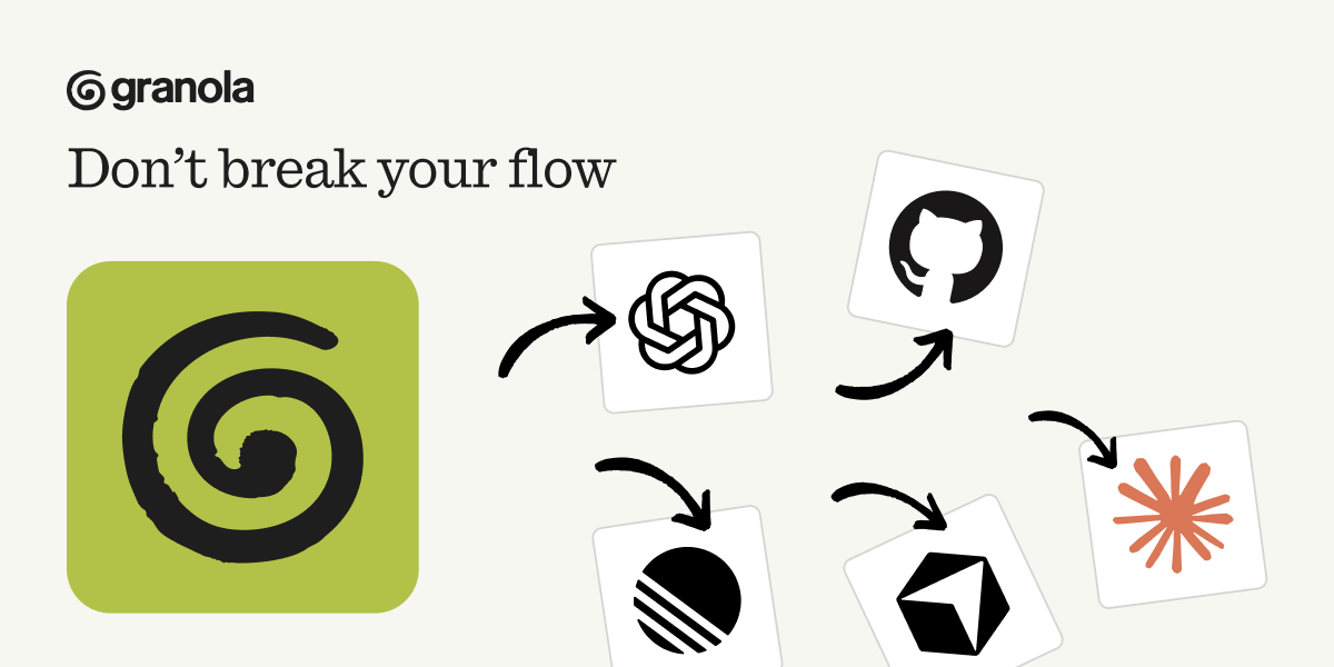
Granola connects your meeting notes to tools like Claude and ChatGPT, so your AI actually understands your work context. Update your CRM, extract tasks, or write follow-ups without copy-pasting a thing.
*Ad